Tailwind CSS for Beginners


What is Tailwind CSS and Why do we use it?
Tailwind is a utility-first CSS framework that uses the concept of utility classes to accelerate your workflow. The framework is lightweight, has a small footprint, and loads very quickly, making it the perfect option for your projects. It is an ideal solution for websites of all types, from blogs to eCommerce stores. Unlike other CSS frameworks with a massive library of styles, Tailwind is a focused toolkit. It is created for developers with a focus on simplicity and ease of use, and it doesn’t require any predefined structure within your project.
Advantages of Tailwind CSS-
1.Tailwind helps us to build responsive websites fastly.
2.Tailwind helps us to make the changes in the desired manner.
3.Tailwind generally makes CSS styling faster in the long run.
4.With the help of Tailwind CSS, we can customize the designs to make the components rapidly.
5.This helps us to maintain the code base easily.
Disadvantages of Tailwind CSS-
1.Its easy to start with Tailwind, but if you want to master it, you have to go through an extensive learning curve.
2.The people who are just starting to learn Tailwind CSS, can confuse a bit because it combines both styling and HTML.
How to Install Tailwind?
Before you start using Tailwind, you first need to install it in your project. Or you can use the Play CDN to try Tailwind right in the browser without any build step, and You can do this by adding the Play CDN script tag to the <head> of your HTML file and start using Tailwind’s utility classes to style your content.
Add the Play CDN script to your HTML-
<script src="https://cdn.tailwindcss.com"></script>
<!doctype html>
<html>
<head>
  <meta charset="UTF-8">
  <meta name="viewport" content="width=device-width, initial-scale=1.0">
  <script src="https://cdn.tailwindcss.com"></script>
</head>
<body>
  <h1 class="text-3xl font-bold underline">
    Hello world!
  </h1>
</body>
</html>
Try customizing your config-
You can also edit the tailwind.config object to customize your configuration with your design tokens.
<script>
    tailwind.config = {
      theme: {
        extend: {
          colors: {
            myBlue: '#2827CC',
          }
        }
      }
    }
  </script>
<!DOCTYPE html>
<html lang="en">
<head>
  <meta charset="UTF-8">
  <meta name="viewport" content="width=device-width, initial-scale=1.0">
  <script src="https://cdn.tailwindcss.com"></script>
  <script>
    tailwind.config = {
      theme: {
        extend: {
          colors: {
            myBlue: '#2827CC',
          }
        }
      }
    }
  </script>
</head>
<body>
  <h1 class="text-3xl font-bold underline text-myBlue">
    Hello world!
  </h1>
</body>
</html>
Flex in Tailwind CSS-
Utilities for controlling how flex items both grow and shrink.
### Basic usage- Initial-
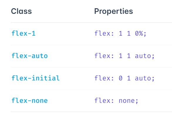
Use flex-initial to allow a flex item to shrink but not grow, taking into account its initial size:
<div class="flex">
<div class="flex-none w-14 h-14">
01
</div>
<div class="flex-initial w-64 ...">
02
</div>
<div class="flex-initial w-32 ...">
03
</div>
</div>
Flex 1-
Use flex-1 to allow a flex item to grow and shrink as needed, ignoring its initial size:
<div class="flex">
<div class="flex-none ...">
01
</div>
<div class="flex-1 w-64 ...">
02
</div>
<div class="flex-1 w-32 ...">
03
</div>
</div>
Auto-
Use flex-auto to allow a flex item to grow and shrink, taking into account its initial size:
<div class="flex ...">
<div class="flex-none ...">
01
</div>
<div class="flex-auto w-64 ...">
02
</div>
<div class="flex-auto w-32 ...">
03
</div>
</div>
None-
Use flex-none to prevent a flex item from growing or shrinking:
<div class="flex ...">
<div class="flex-none w-14 h-14 ...">
01
</div>
<div class="flex-none ...">
02
</div>
<div class="flex-1 ...">
03
</div>
</div>
Hover, focus, and other states-
Tailwind lets you conditionally apply utility classes in different states using variant modifiers. For example, use hover:flex-1 to only apply the flex-1 utility on hover.
<div class="flex-none hover:flex-1">
  <!-- ... -->
</div>
For a complete list of all available state modifiers, check out the Hover, Focus, & Other States documentation.
Conclusion-
Thanks a lot for reading and hope now you know about Tailwind CSS. For more information please checkout the official Tailwind CSS website.And don't forget to hit a 👍 if you find this article helpful. Happy learning! 🎉
Reference-
1.W3Schools
2.TutorialPoint
3.MDN
4.Tailwind CSS official website